CMS338 Learning Objective 4:
Articulate the strengths and weaknesses of design choices made in executions
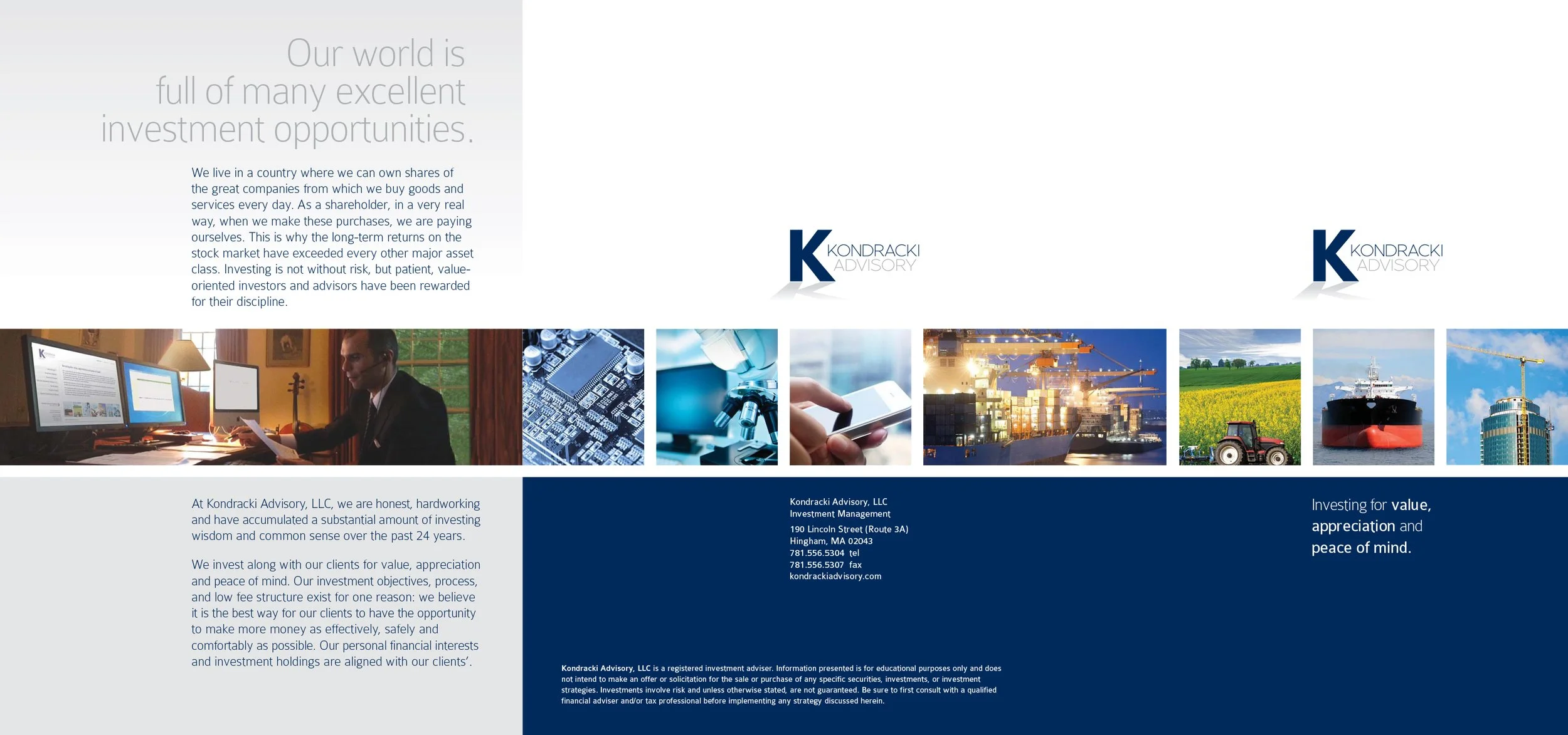
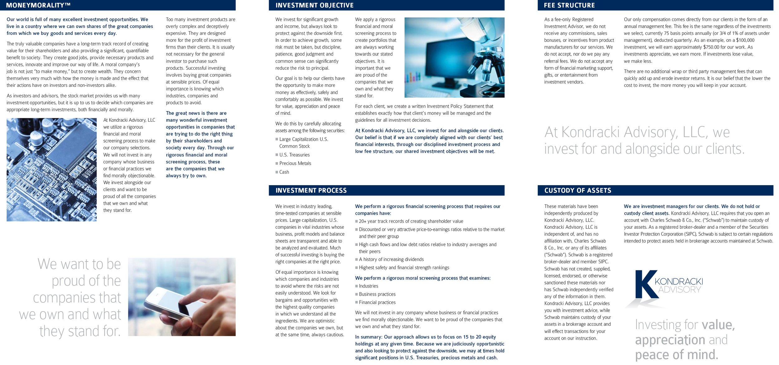
Kondracki Advisory (2012)
Chris Kondracki opened his own investment management firm in 2012. As has been my experience with many financial professionals, their expertise lies less in creative endeavors and more in working with numbers. I was able to work with Chris to develop descriptions of his investment philosophy. MONEY MORALITY, which I highly respect.
While I believe this brochure successfully communicates the information relevant to any initial discussions with potential investors, I feel this design falls short of truly establishing an identity for Chris, his company or his signature investment philosophy. One could easily substitute a different name (even in the logo), insert different copy, and it would be just as successful. This piece barely clears the bar for successful communication, while achieving no real design success.
Ironically, the voice and visuals established in this first marketing piece are still the Kondracki standard today.
Click either image to view the PDF.
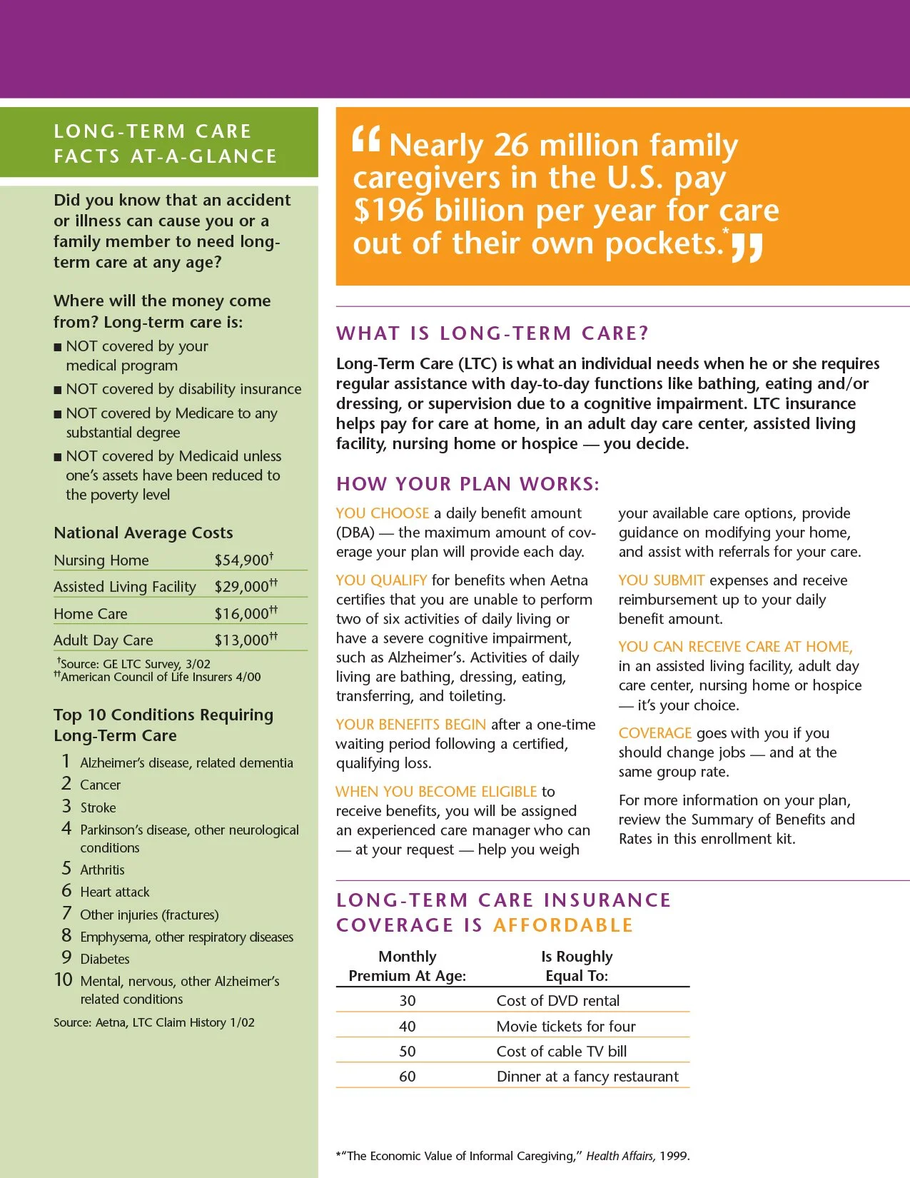
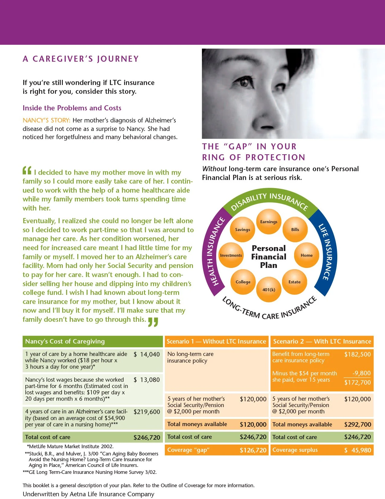
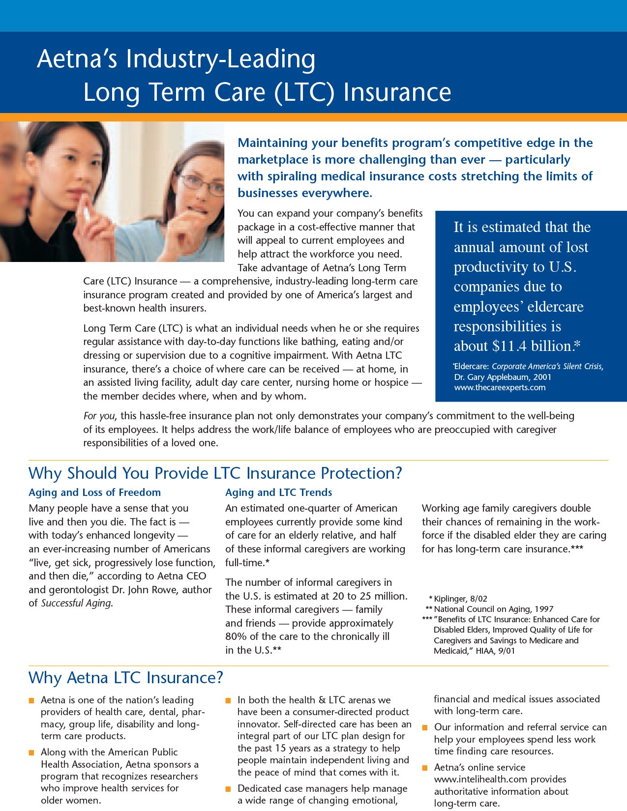
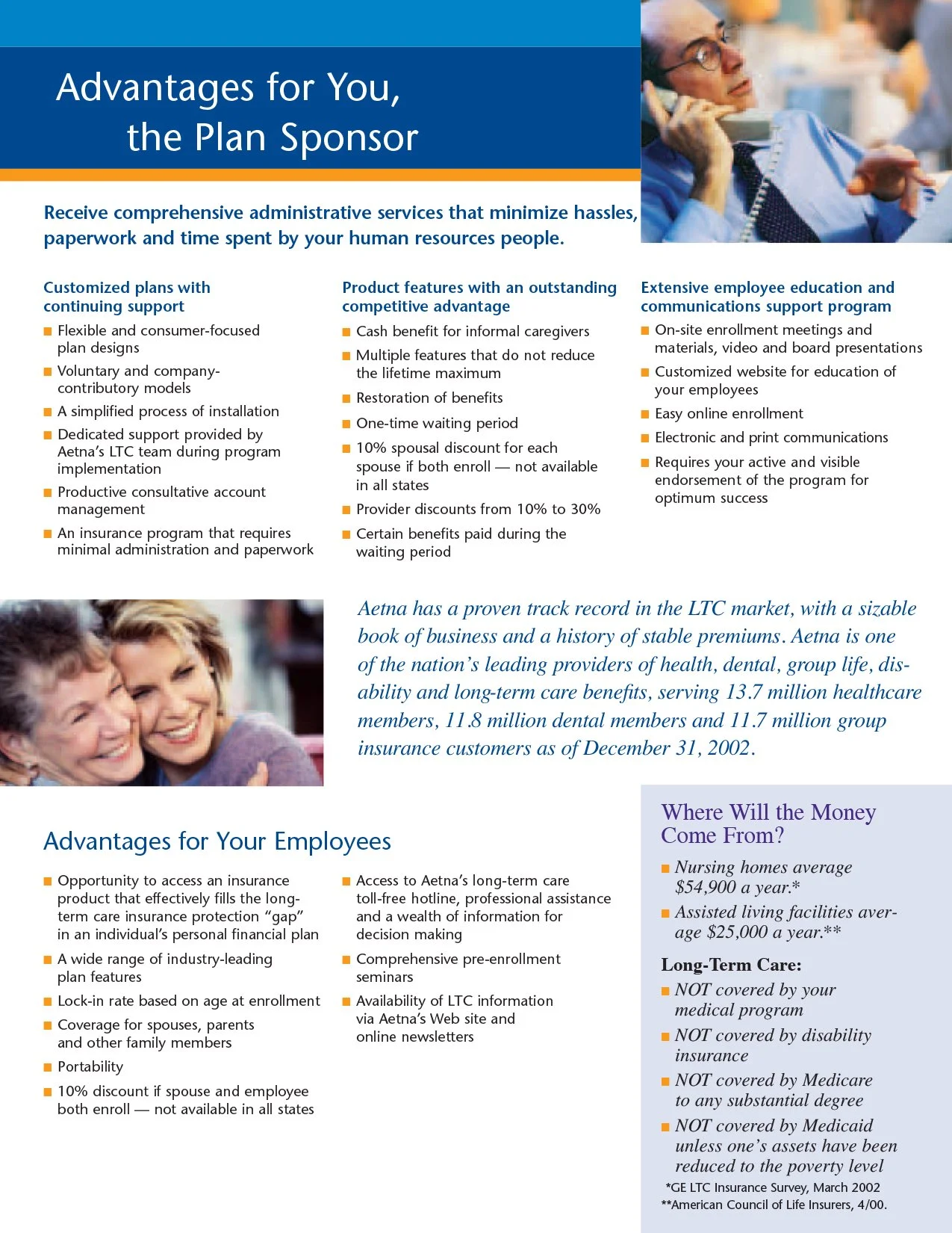
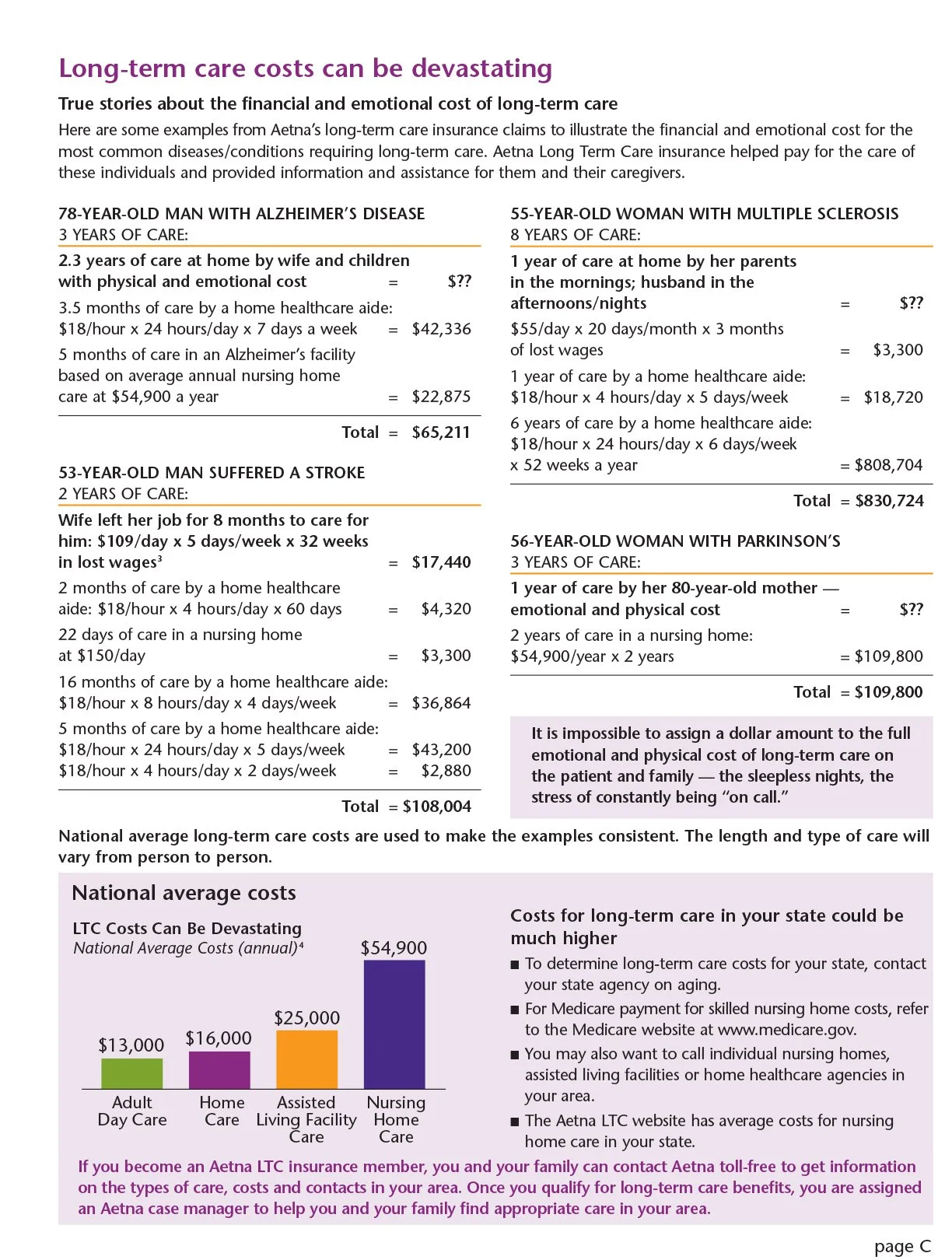
Aetna Long Term Care (2002)
Aetna, one of the leading insurance companies in the US, required full suite of sales and enrollment materials for their line of Long-Term Care insurance products. This would involve not only developing the materials necessary to sell to sponsor companies and conduct enrollment meetings for employees, but would require defining the the sales and enrollment process as well.
Aetna came prepared with more than just the request. At our first meeting, they were armed with a creative brief and scope of work. They were clear about what they wanted and that my team’s role was to execute on their direction. This was an unusual situation for my team, and we tread lightly with any questions or pushback.
The resulting kits, according to client feedback, worked successfully to generate business. However, I can’t help but feel the pain of any potential participant having to sit through an enrollment meeting and digest the unavoidably complex insurance information delivered via such overly colorful designs and dense typography crowded onto so few pages. The majority of my time during this initiative was spent organizing information so that it could be presented in a logical and chronological order. Cost concerns and the necessity for digital variable printing caused reductions in page counts that inevitably made the final design an overcrowded, visually dense, and almost unfriendly to interact with, in my humble opinion. The client was satisfied with the work, and its performance, but this is not a piece I usually include when showcasing my work.
Click each of the images to view the complete PDF.


Wells Fargo Private Client Services (2004)
Turning from weaknesses to strengths, I will again point to Wells Fargo Private Client Services material as an entirely successful design. The engagement of the client and their belief in our strategy formed the foundation for this success. Their trust in us opened doors to their museum collections, helped us form relationships with their curators who enthusiastically participated in photo shoots. Their product specialists were deeply involved in writing and fine tuning copy to the “stage” theme, ensuring appropriate and powerful messaging. That collaborative spirit in turn empowered our designers to fully immerse them selves in the project and deliver a superior product, right down to the real leather strap securing the entire collateral package.
Click an image to see a larger view.