CMS338 Learning Objective 2:
Plan, compare, and assess
a variety of design options to address specific communication problems… includes creating, combining, and evaluating numerous drafts
Assessing options is a critical exercise at any stage of the creative process. The final product is always the result of evaluating a series of alternative ideas that become preliminary content and design. Those in turn become the final completed deliverable.
Unfortunately, when selecting pieces for my portfolio over the years, it has almost exclusively been the final deliverables that have been chosen, in part because previous sketches, copy, comps, and other studies have been discarded as projects are completed. I can, however, present a few examples of how choices have been made regarding alternative design options, and how


The Siegfried Group (2007)
These brochure examples, produced 18 months apart, demonstrate the impact attention to client input and response can have on design. Though the changes may seem subtle initially, each was based on specific feedback from actual clients and resulted in what my client felt was a more valuable tool for developing new client relationships.
On the cover, the addition of the title immediately lets the viewer know what is to be found inside. The initial version could have held information on literally any aspect of the company.
Instead of repeating the title on the inside spread, the viewer is given a taste of the value proposition in the phrase “Your Goals Achieved with Siegfried.”
The illustration of fluctuations in workforce demand was revised to more closely represent the rise and fall of demand throughout the entire year, rather than just a single example.
While still offering a list of the many values of the Siegfried services, the new version of the brochure focuses more on illustrating how the company can assist in several specific industries. The most common client response to a Siegfried proposition was to ask, “I see you have a wealth of accounting experience, but can you help my business specifically?”
While these updates may seem subtle, and possibly superficial, each was driven by client input and affected not only the content itself but the order in which it was delivered to the reader. Our anecdotal research concluded that these changes helped sales conversations turn from answering the initial standard questions to discussing the specifics of a relationship.
Click each image for a larger view.
Ryan Hall Pest Control (2022)
This was a small, personal project for an acquaintance who was starting up his own pest control business. I learned a key piece of information during discussions with Ryan: pest control companies prefer to be outwardly anonymous, and so do their customers. Ryan did not want announce to all of his client’s neighbors they he was dealing with a bedbug infestation, for example. And his customers certainly didn’t want that either.
The other key concept in this design was that Ryan used a very targeted method for dealing with unwanted pests. Rather than a “spray and pray” method of extermination that spread toxic chemicals throughout a home, Ryan injected his products in strategic locations, thereby dealing with the problem and not driving the customers from their homes for days at a time.
To satisfy both messaging (or lack of messaging) criteria, I chose an arrow theme to represent the targeted nature of the service, and avoided any indication of pest control but still kept this identity specific to Ryan by using his initials in combination with the arrows. Of the resulting several designs shown, he ultimately chose the stone arrowhead design.
Click the image for a larger view.


Healthfirst
Pharmacy Incentive Program (2025)
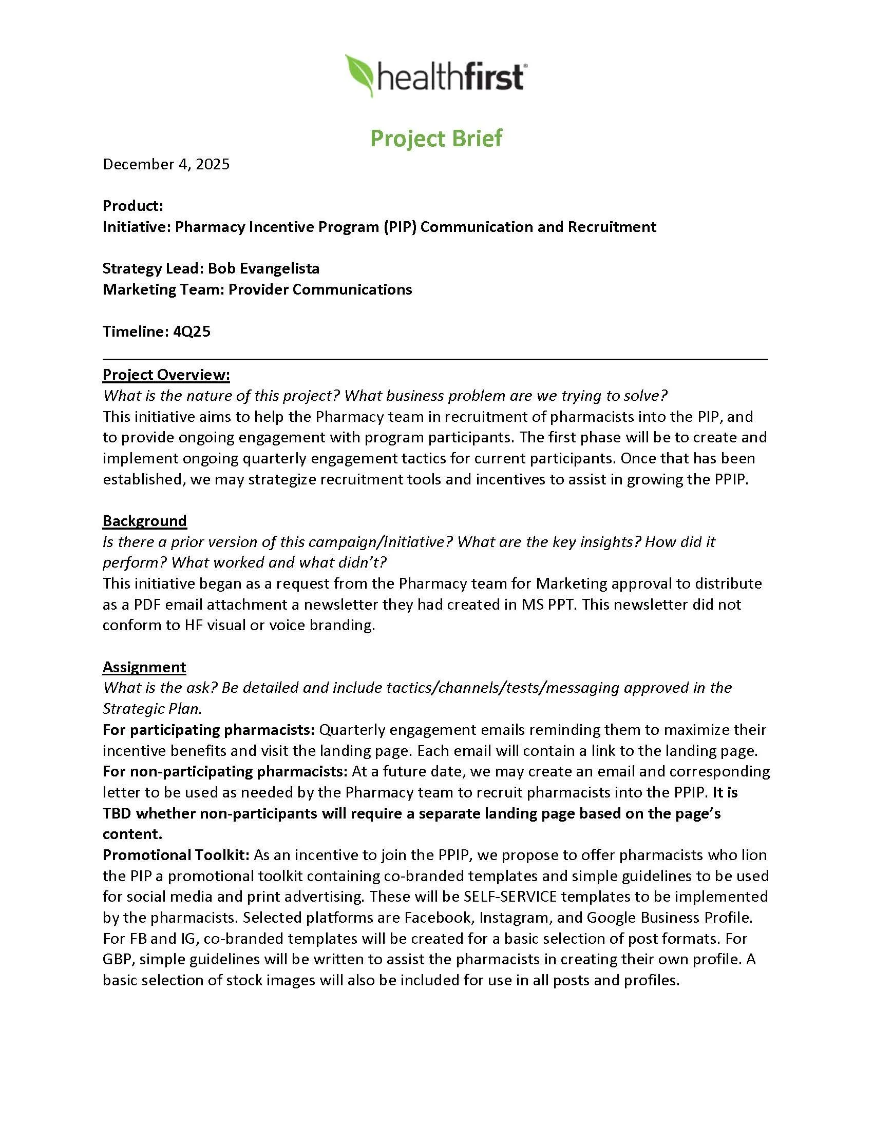
My current position with Healthfirst is primarily a strategic one, a large part of which is to analyze or “screen” incoming requests to determine if what is being asked for is actually the most effective approach to achieve the stated objective.
Such was the case when our Pharmacy team asked for approval to distribute a newsletter they had created in MS Word. There were several reasons I rejected the request, from lack of branding to the choice of email as the distribution channel. I saw this as an opportunity to offer our participating pharmacists much more in terms of convenience, timeliness, an future engagement.
After evaluating the initial two newsletters created by my Pharmacy team (shown below), I directed my Creative team to develop a digital landing page using the same content, and which aligned with our corporate brand standards. This option addressed our need for greater engagement by facilitating a quarterly email announcing updates, permitted for scalability to any number of participants, and allowed for future updates including password access and display of pharmacist-specific performance data.