CMS338 Learning Objective 1:
Recognize and describe
design concepts and processes
as they appear in communication products created personally
or by others
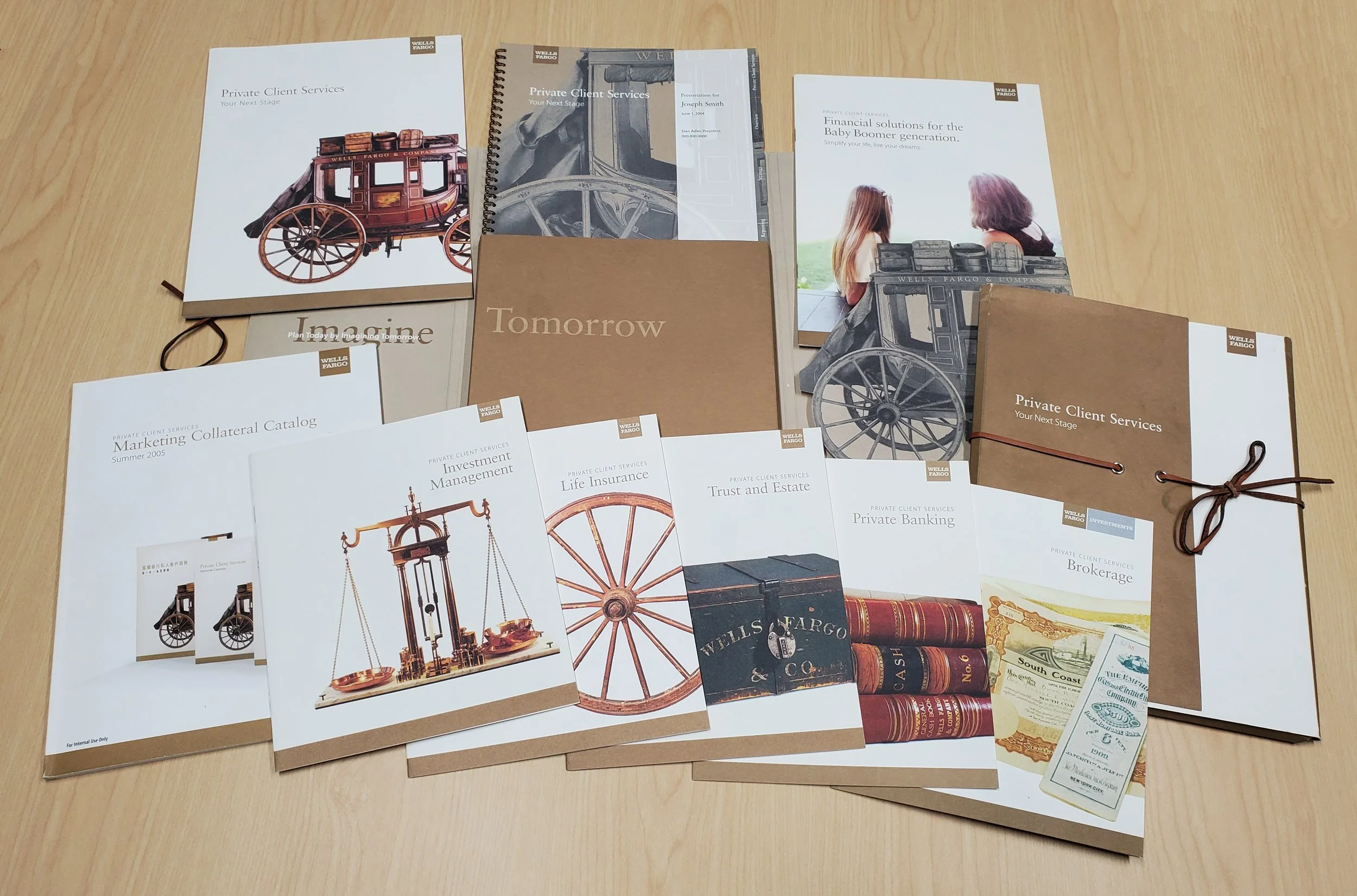
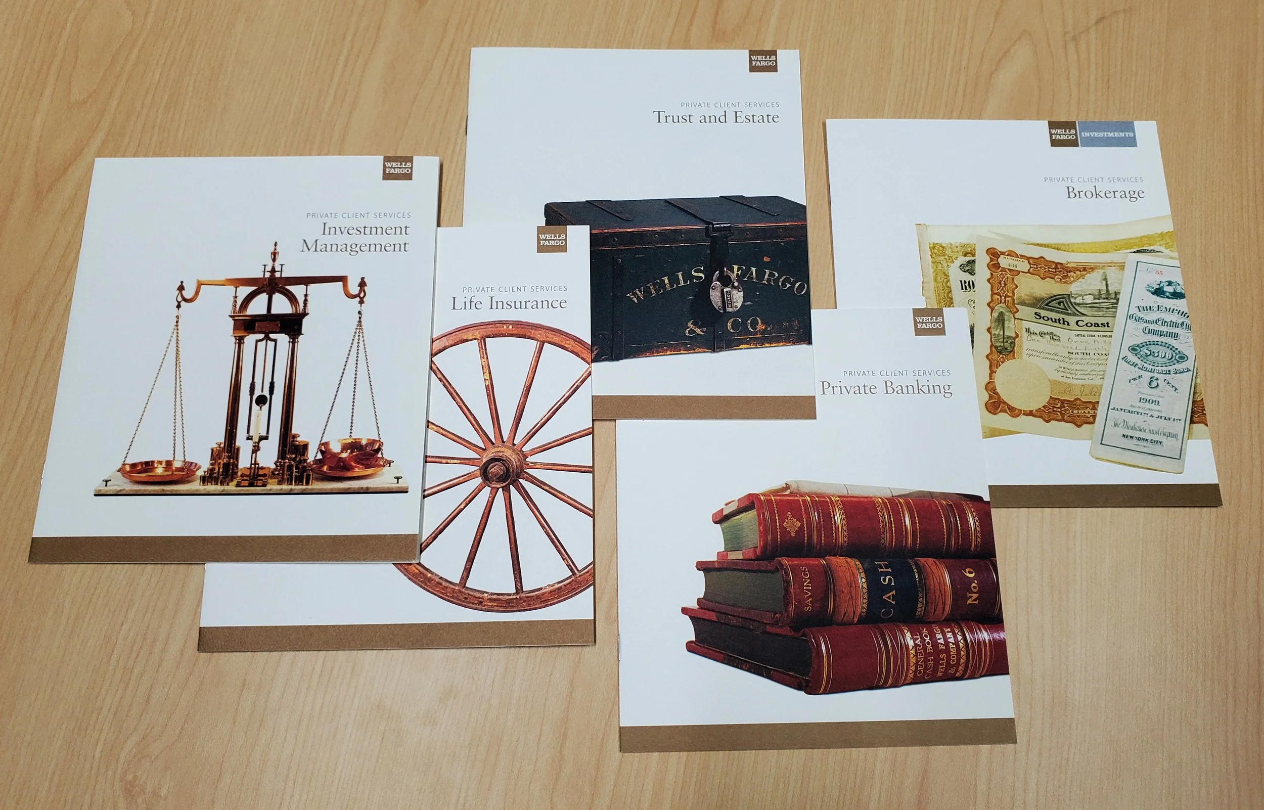
Wells Fargo Private Client Services (2004)
The creation of the Private Client Services sub-brand of Wells Fargo was achieved through a process consisting of the following general phases:
Discovery: interviews with key client stakeholders to determine objectives, budgets, communication channels, brand visual and voice standards
Research: understanding client perceptions among its customers, uncovering and enhancing the brand story, discovering design elements - visual and voice - appropriate to the new sub-brand.
Initial design sketches and comps: Ideas first put to paper and presented to clients for initial rounds of feedback
Final design and copy: client feedback applied to initial designs, final designs constructed for review and approval
This sub-brand’s design reinforces this 160-year-old financial institution’s historical reputation for security, reliability, and longevity through images representing its unique and colorful history. The final design features visuals of historic artifacts gathered from the nine Wells Fargo museums located across the United States, used as metaphors for the firm’s positive attributes. The copy echoes themes of security, trust, and reliability that were the hallmarks of the original Wells Fargo stage coach system. It not-so-subtly uses the word “stage” throughout to refer to the intended client’s period of life and achievement.. The design uses an earth tone palette recalling the Old West, while the layout maintains a clean, contemporary look and feel throughout.
Click each image to view a larger image.
Advanced Radiology (2016)
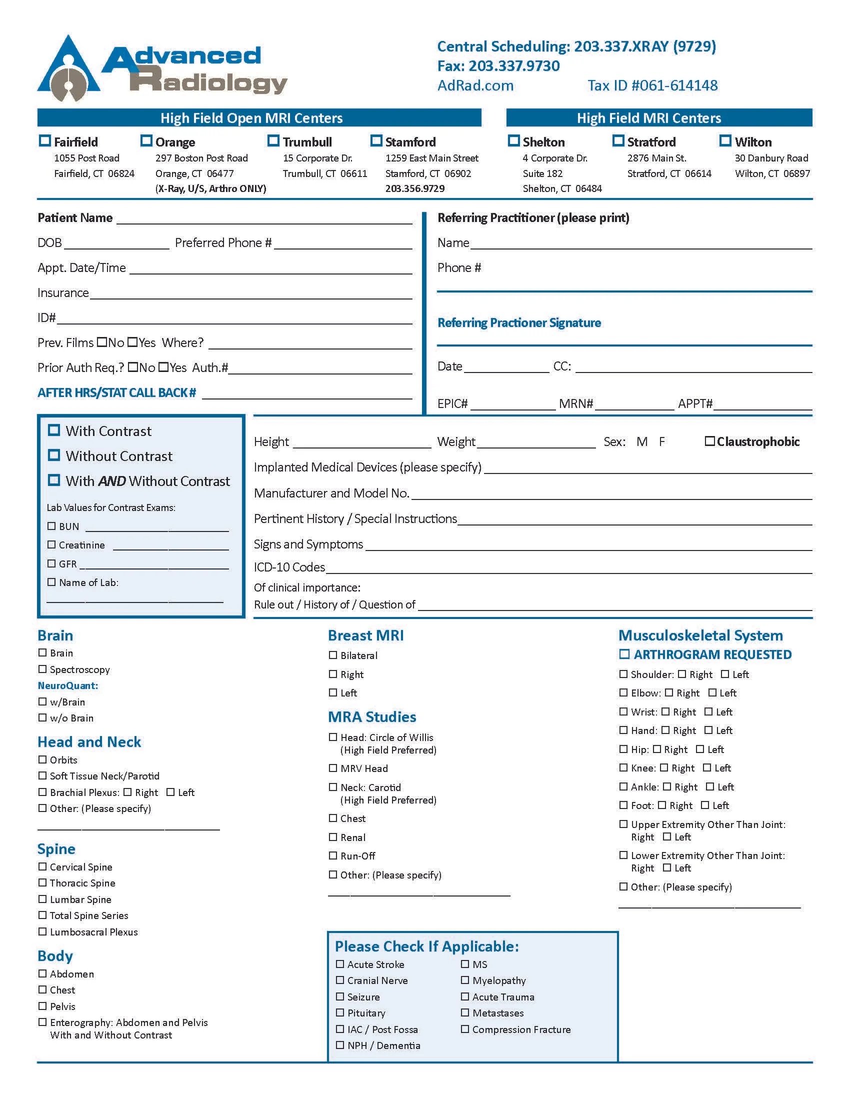
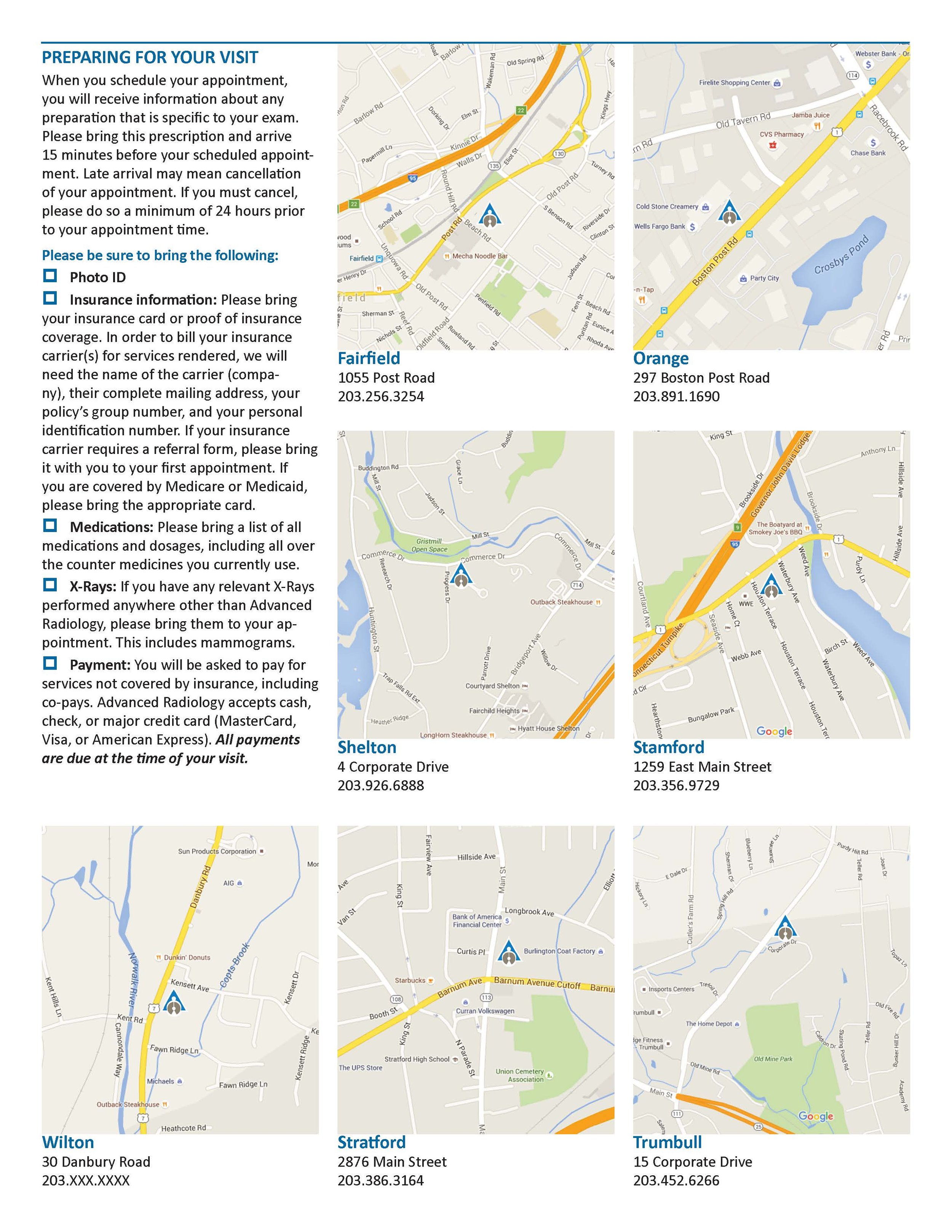
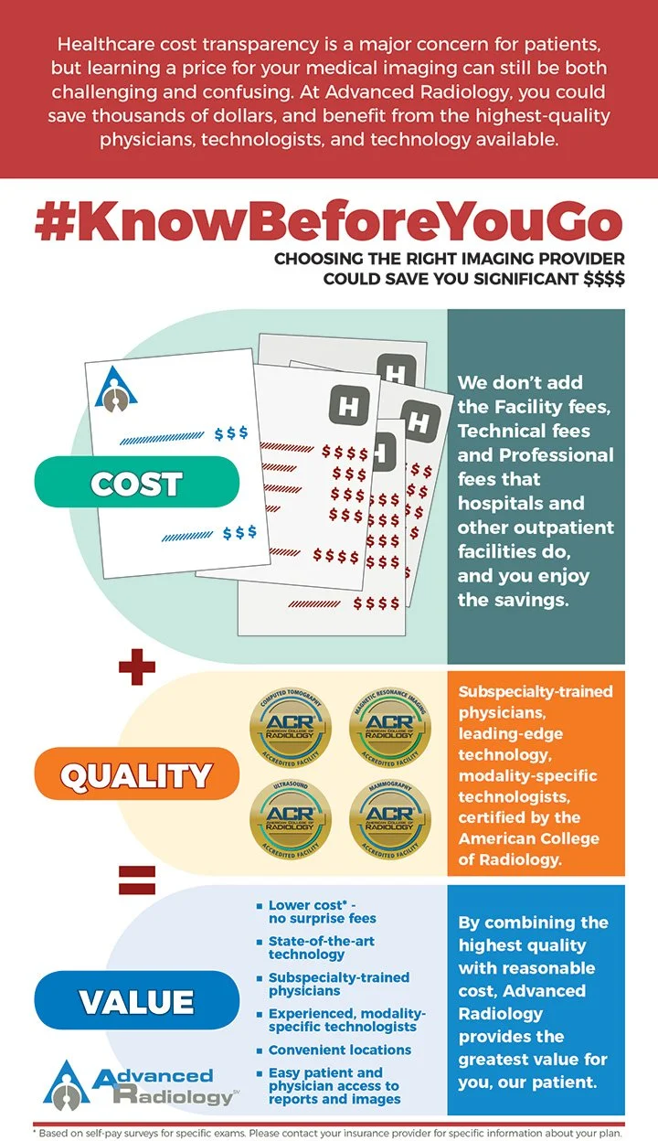
I accepted the position of Marketing Manager Advanced Radiology, at the time Connecticut’s largest independent radiology practice, after that position had been vacant for more than five years. During that time, the “brand” had been reduced to simply applying the corporate logo to any communications material. However, considerable equity existed among the company’s referring physicians and patients. The brand did not require any major change, but needed to be consistently defined and presented. There was considerable reluctance among executives to allocate budget or risk brand recognition, so the work was subtle and completed entirely in-house. This initiative began with establishment of visual standards, which included:
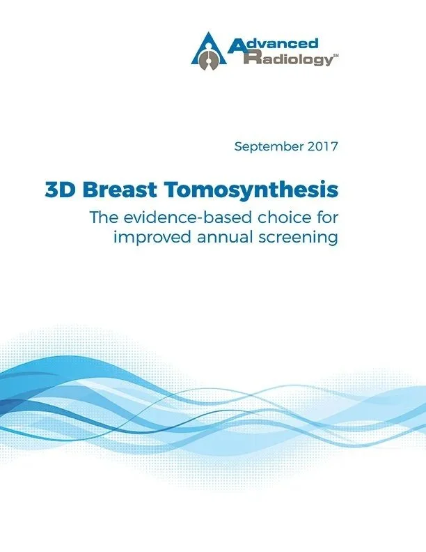
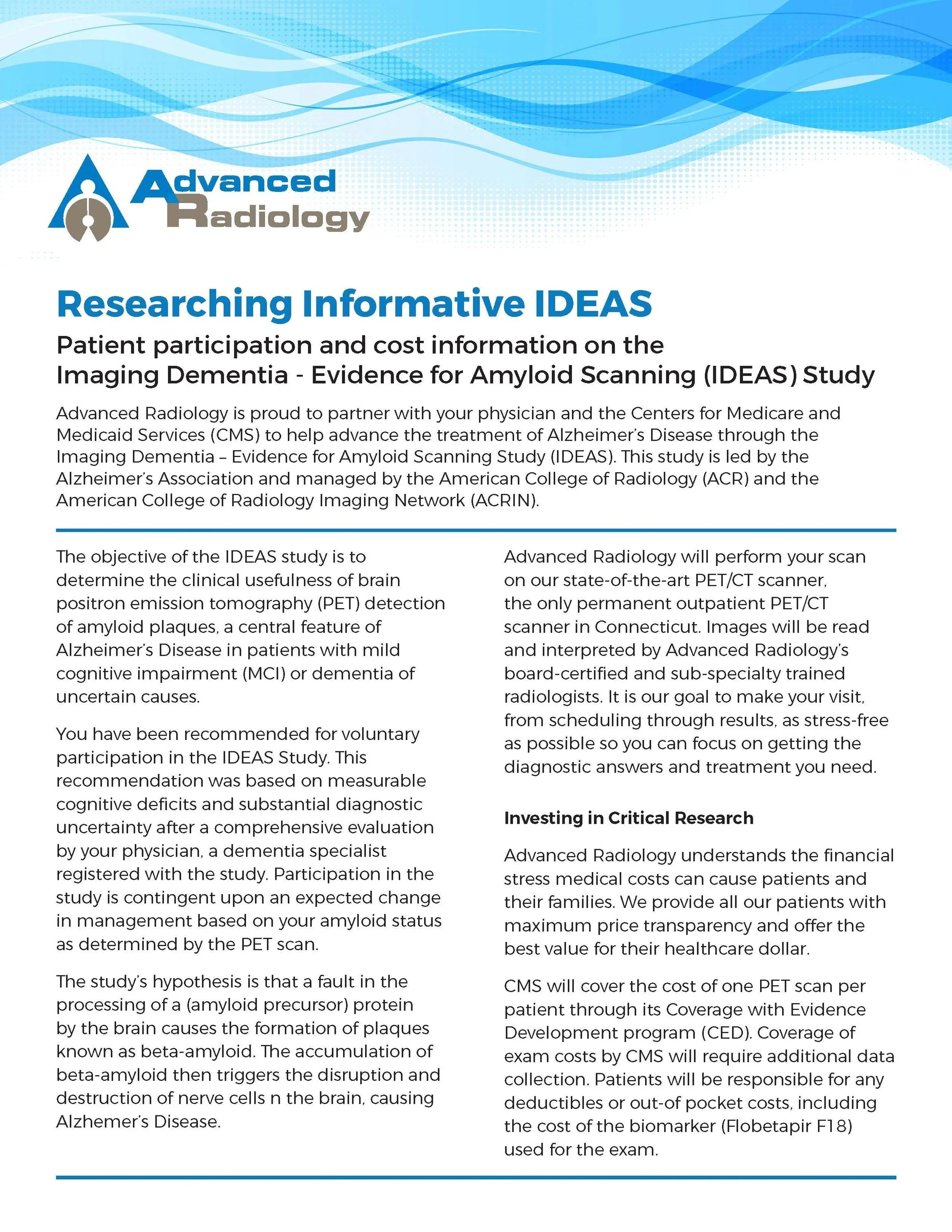
Consistent use of a single font, Montserrat. The font has a contemporary, clean, “healthcare-like” design, with several style variants, and was not being used by any competitors.
Establishment of a color palette beginning with the blue and gray of the existing logo and expanding to a complete spectrum of colors sufficient to be used throughout a variety of material and topics.
The addition of a wave graphic to represent radiology and establish. An identifying visual for the brand in addition to the logo.. All radiology exams rely on some sort of wave or particle energy, whether that be sound, magnetism, radio, or x-rays. The graphic created consisted of both lines and particles, and could be used to represent any of the modalities.
The combination of one or more of these elements helped give the company’s materials a distinct look and feel even in situations where the logo would not be present, and strengthened our brand recognition wherever it appeared in the market.
Click each image for a larger view.
