CMS338 Learning Objective 3:
Prepare visually cohesive
and interesting products
The Siegfried Group (2007)
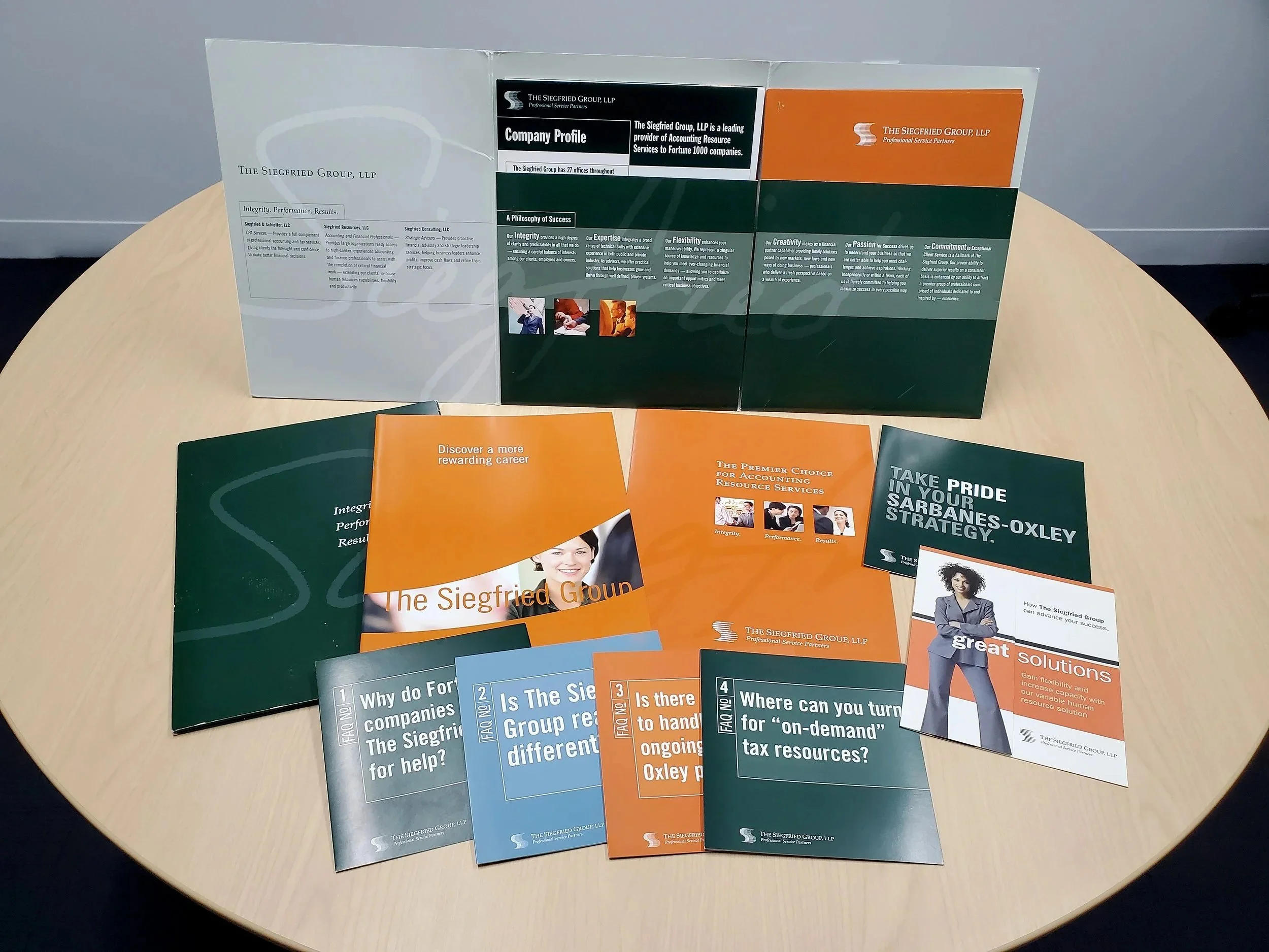
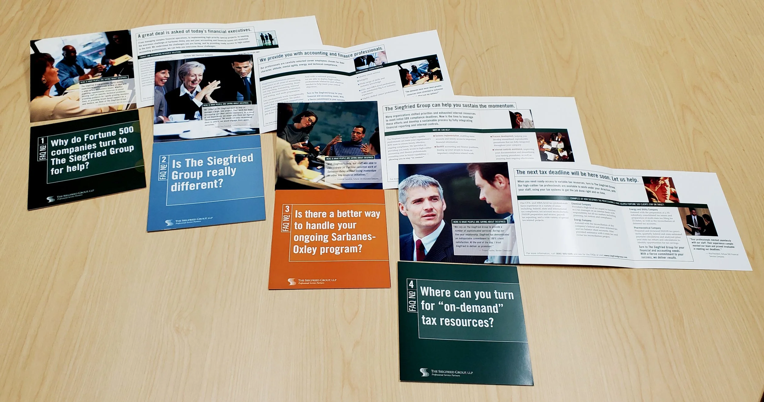
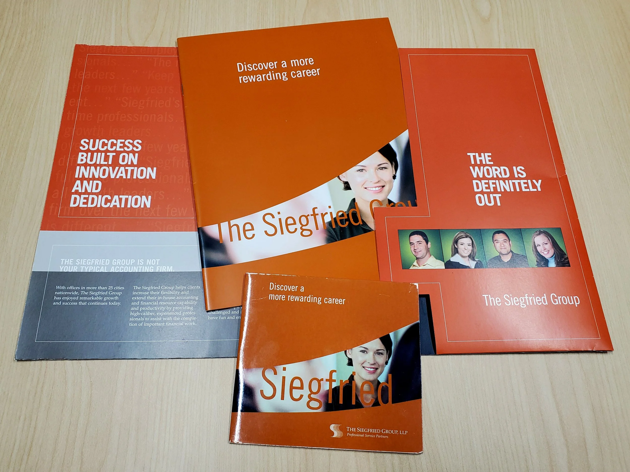
This accounting and contract staffing firm in Wilmington, Delaware, requested a complete upgrade of their marketing for the two major business units - accounting staffing, and professional recruitment. This presented a unique situation; how to create consistent brand visuals while differentiating the different business units just enough. While the typography, layout and overall style remain quite similar, the largest differentiators are the primary colors: green for the accounting staffing business and orange for professional recruitment.
There are more subtle differences as well. The recruitment pieces have a more lively design with photos focusing more on individual people - happy staffers. And one of the major value propositions of Siegfried with regard to hiring is that they want their workplace to be “fun.” Hardly something that would be an important aspect of accounting services.
Click any image for a larger view.
Davis Selected Advisors (2008)
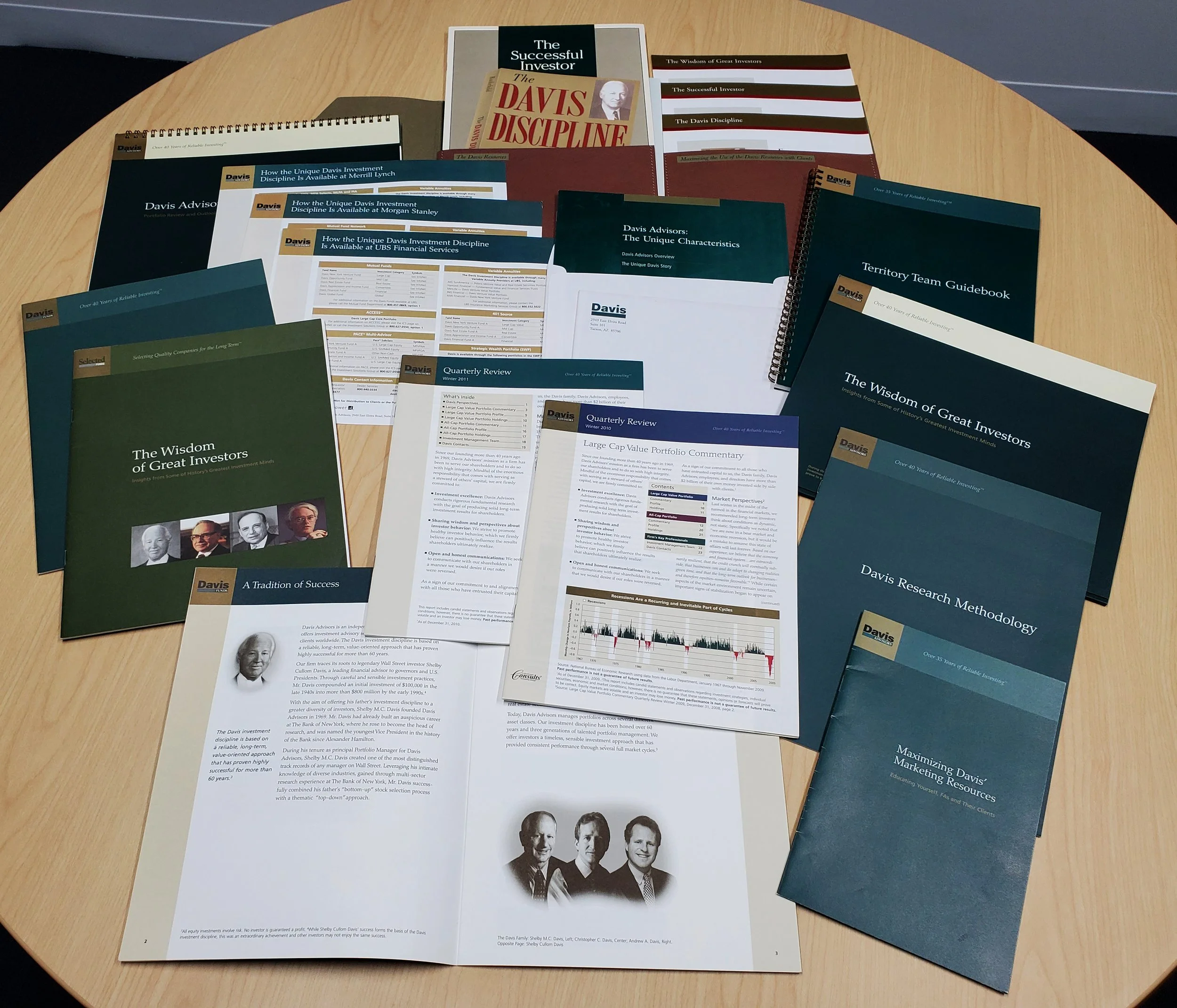
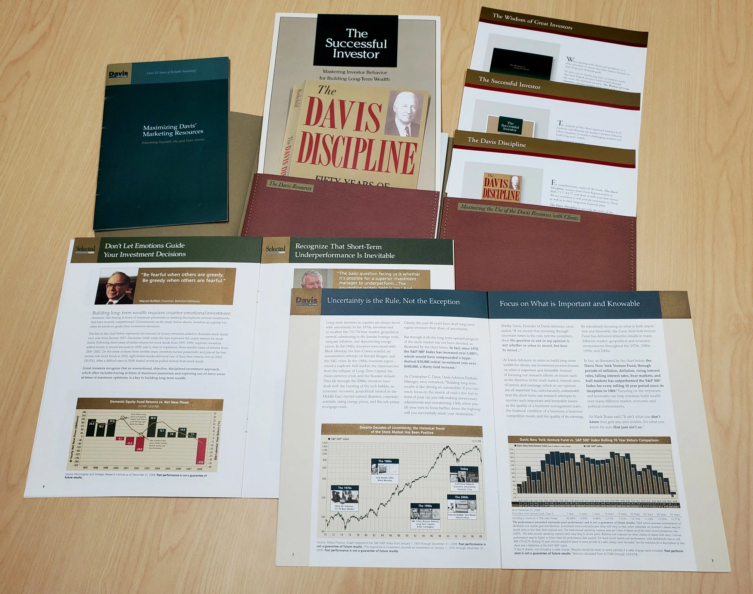
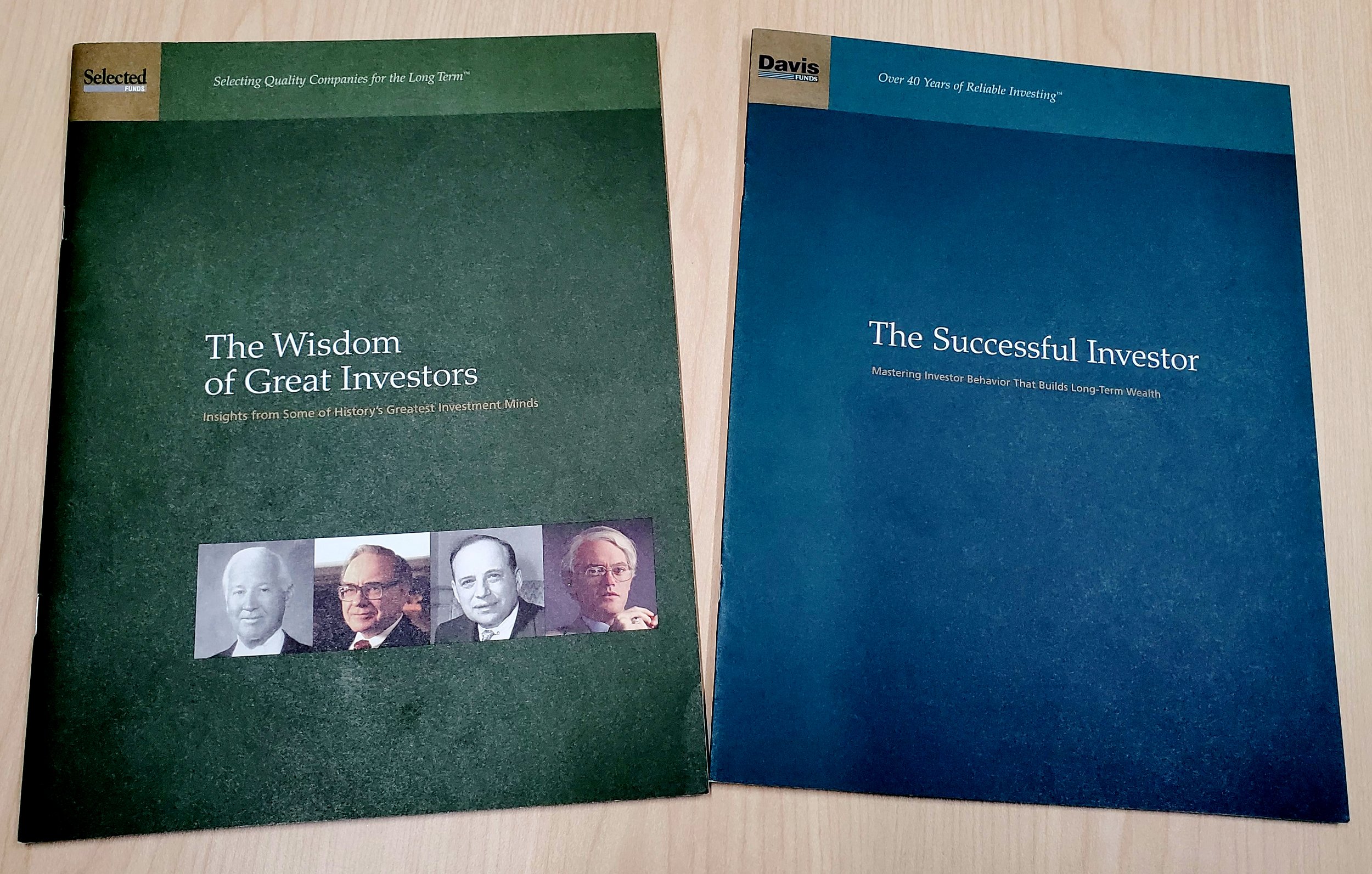
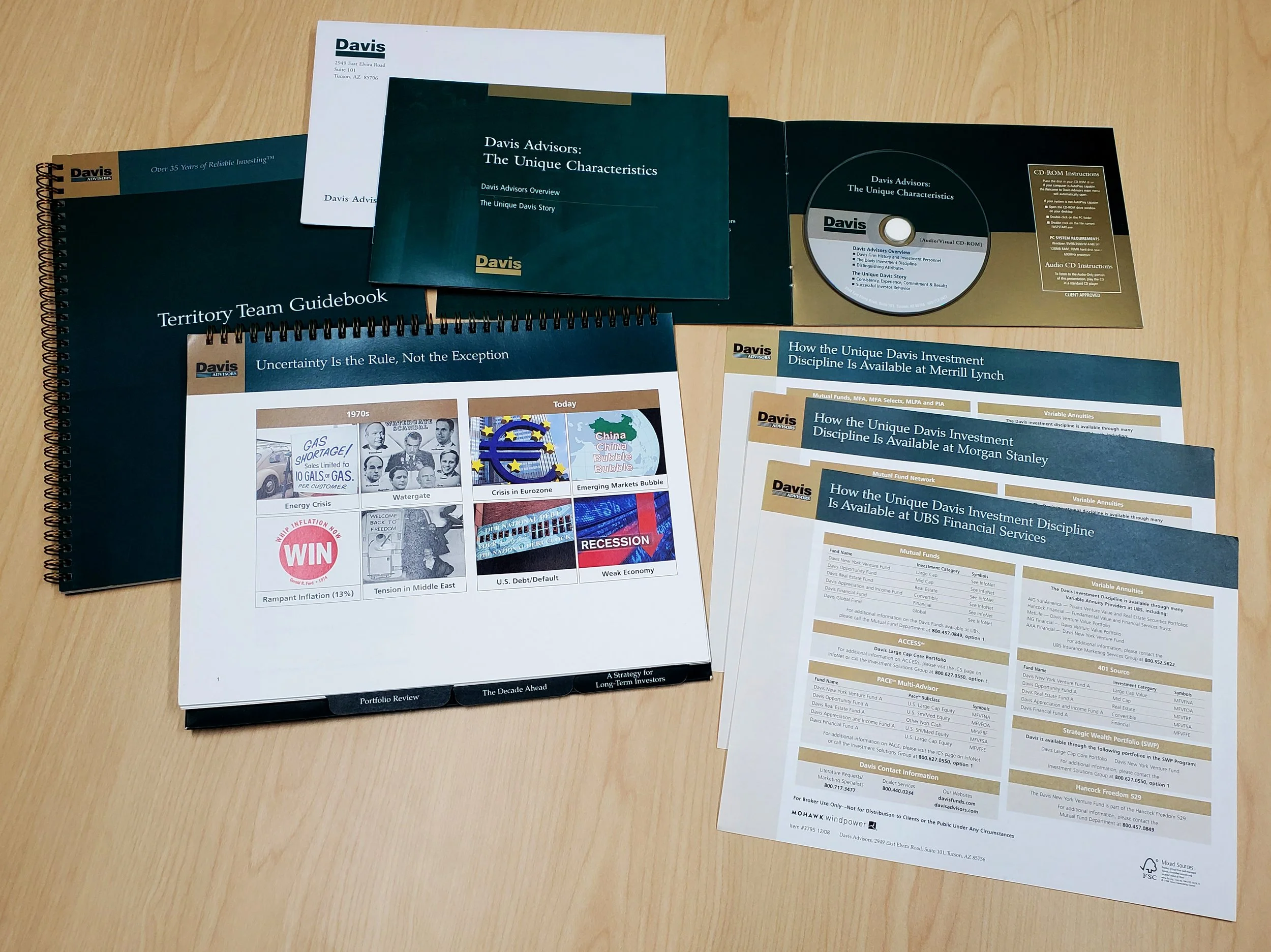
While I was a Marketing Manager at this NYC investment firm, I created and maintained many publications, from quarterly and annual performance updates, investment strategy documents, and promotional publications.
This was a unique situation, as I had been the account manager for Davis while at Stan Adler Associates, where we had gone through a brand refresh for all of Davis’ documents. I then moved to my position at Davis and worked closely with former colleagues to manage development of all marketing material. This allowed me and my former team to maintain flexibility with consistency throughout all our projects.
Click each image for a larger view.
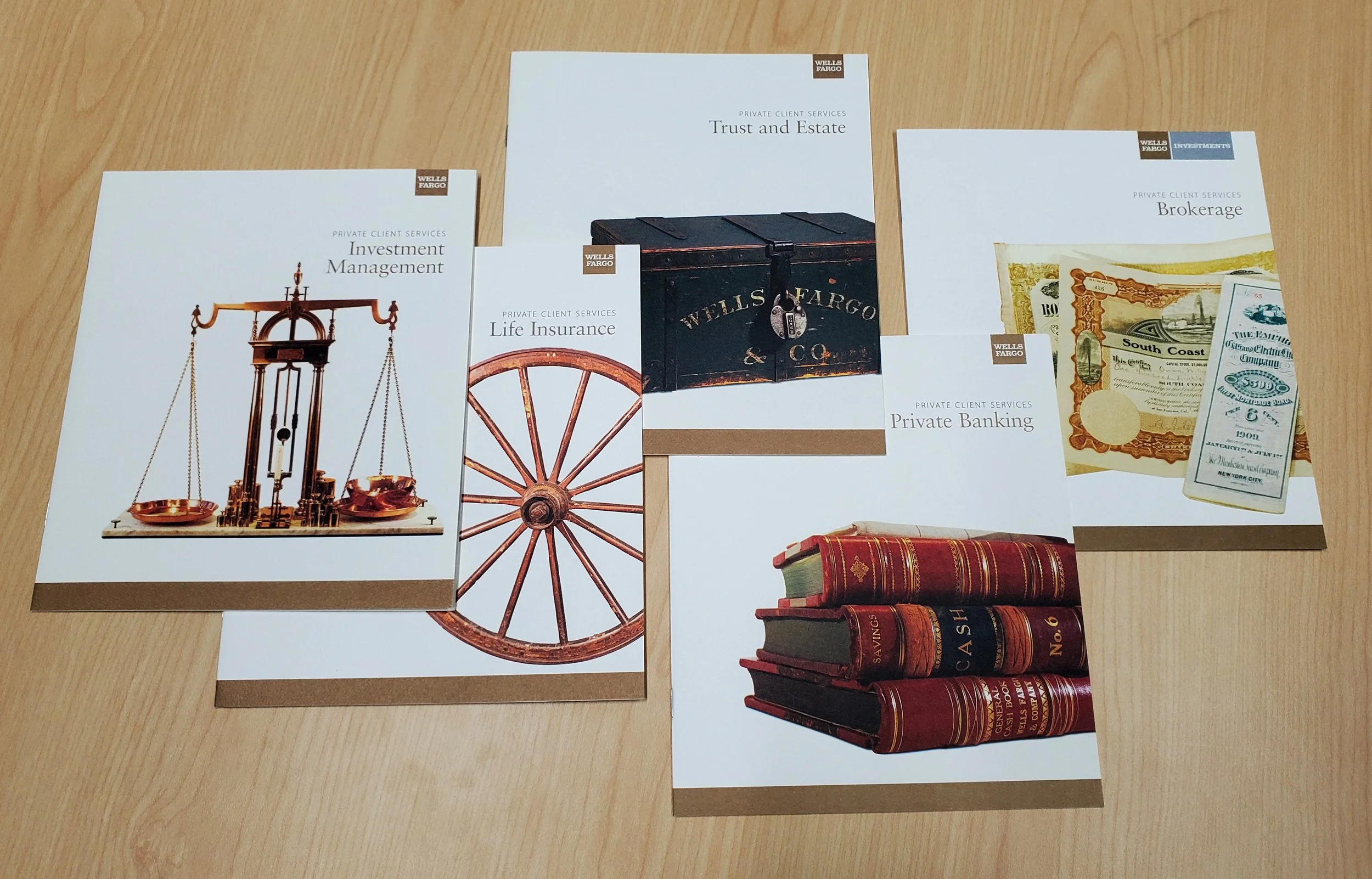
Wells Fargo Private Client Services (2004)
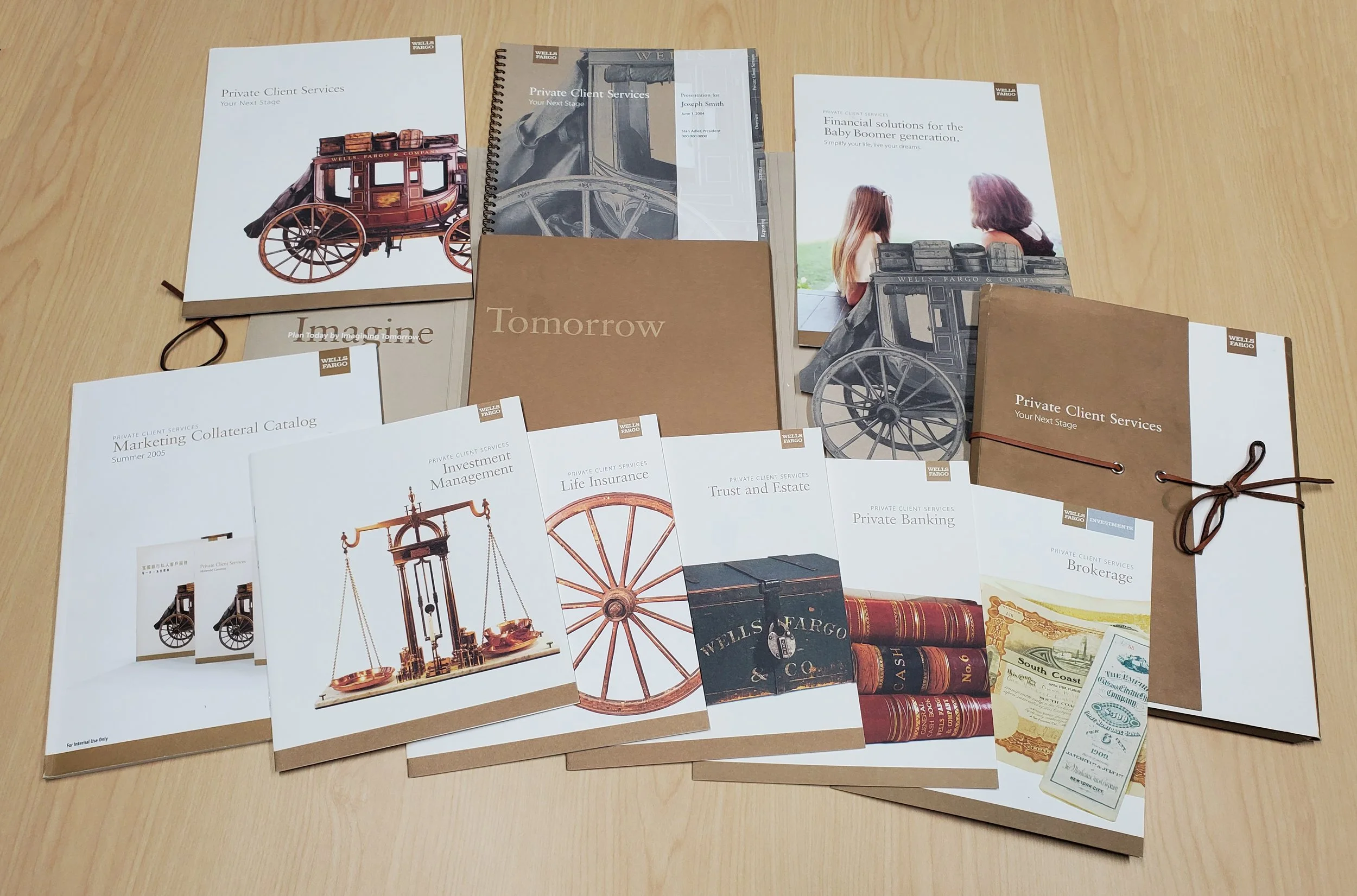
In developing this sub-brand of Wells Fargo, the strategy was to reinforce the firm’s strong historical reputation and longevity through images representing the unique and colorful history of this 160-year-old financial institution and resonate with the high-net-worth market..
The solution features visuals of historic artifacts gathered from the nine Wells Fargo museums located across the United States, used as metaphors for the firm’s positive attributes. The copy echoes themes of security, trust, and reliability that were the hallmarks of the original Wells Fargo stage coach system. The design uses an earth tone palette recalling the Old West, while the layout maintains a clean, contemporary look and feel throughout.
These elements were carried throughout further development of individual topic brochures, presentation material, and sales collateral.
Click each image for a larger view.
